First of all we were given a sheet which outlined all the different aspects of the school that make it what it is today, this included the fact that it has a status of being a 'Arts School', its a mixed comprehensive ranging from the ages of 11-16, its part of the La SWAP Sixth Form Consortium along with three other schools located near by and its heavily involved in a anti-bullying programme as well as other things. From we were asked to look at each of these points and see how it could relate or influence any decisions made on our magazine. For example the fact that it is a Arts school made me see that i should look to including a few pictures of someone maybe dancing or acting and since its a mixed comprehensive i should look to show a even amount of boys and girls in the magazine in relation to what pictures i should use for it.
My next job was to think of a name, subheading and tag line for the magazine as well as a link to the ABS website and the issue number/date of the magazine. After thinking over about this thinking about the different aspects of the school i came up with the name 'Acland Burghley Skool' with the tag line 'The Koolest Magazine Out There!' because I felt it gave it a edgy feeling that would relate to the young audience that I am targeting it at. I then went and took the 6 pictures I wanted for my magazine which had to represent life at Acland Burghley as well as fitting in which the theme of my magazine (pictures can be found in 'Original photos and preliminary task'.
This is the finished version of my front cover for my school magazine. I decided to use the colours of blue and purple as the main fonts as well as using a font style that i think along with the colour looked very energetic and vibrant which relates with the energetic and vibrant nature of kids these days. I also used a speech bubble with the subheading "meet the students" in it because i thought that if I used a speech bubble coming from a actual student it makes it feel like this really is a magazine by the students for the students which is catering to some of their needs. The image I used for the front cover is very different in contrast to the one shown in 'Original Photos and Prelim Task' this is because i decided to change the colour of the actual image making it slightly darker as well whilst making the background around him lighter to make him stand out more in the image since he is the main point of the front cover. This was done using photoshop because not only did it let me change the colour and light of the image but also allowed to crop and manipulate the image slightly to get unnecessary images in the background which emphasised the fact that the boy is the vocal point of the front cover more.
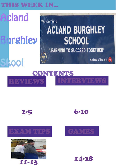
My contents page stuck to the same colour scheme of purple and blue like my front cover because I think associated with my magazine. The images on this page have not been cropped of manipulated because I felt that they were not the main points of the contents page so instead I focused on creating a colour backdrop for the feature titles like 'reviews and 'interviews' using photoshop allowed me to create a colour backdrop for this using purple to stick with my ongoing theme of purple and blue. I decided to use a big font size because i felt it would cause less confusion amongst readers.


No comments:
Post a Comment