Thursday 16 December 2010

Audience feedback


Here I was able to get members of my class to me some feedback on my magazine. This shows that I did a very good job in following the correct codes and conventions for a Hip-Hop magazine as it is evident in this video by the amount of people that straight away was able to understand the concept of the magazine through the codes and conventions i had used.

This included things like:

  • The Color scheme
  • Images used
  • Masthead
  • Fonts used
  • Urban Slang used
  • Pricing of the magazine
  • Reference to famous Hip-Hop artist e.g. 'Rick Ross'
  • Strap line 
  • Link to external website (Twitter)


What do you feel you have learnt in the progression from the preliminary task to the full product?

Wednesday 8 December 2010

A new song that I like and represents my magazines genre of music


Review of Promotional Article

To prepare for the upcoming publication of my music magazine I had to create a feature article that promoted my new artist. this had to be done by showing my persuasive writing skills and also connecting to my magazines target audience. In my article my main feature was promoting two new rappers who have recently risen to near dominance in the rap scene and gives readers a insight into their life and personality and success to date.


The persuasive techniques that i used mostly were hyperbole, which was used to exaggerate certain aspects of my artists and a lot of statistics to really show my audience about the success of my artists, I learnt how to do this by looking at a example of a promotional magazine which was about mercury award winning artist Dizzee Rascal were a lot of hyperbole was present to exaggerate his already huge success as well as statistics and a quote from a famous artist giving him praise and also a list of the different destinations that he has performed in.

Looking at this article was a good thing to base mine on as it allowed me to see and learn the different techniques that I would have to use in order to write a promotional article effectively.

When writing my first draft I made the mistake of writing too much and going off topic, doing a interview based article rather than focusing on the promotional part of it, although my introduction was good I didn't really promote my NEW artists, but instead it was written as if they were already established stars in the music business.

When I recieved my first draft back I corrected this by use a lot more of the promotional writing techniques as i stated earlier implementing hyperbole, statistics, list of destinations my artists have been to, quotes from famous people, financial figures, timeline of their success to date and also promoted a new upcoming debut album they were releasing.

This not only gained me a good understanding of promotional techniques of writing, but also allowed me to see how to write a article for a magazine, something I had no experience of doing prior to this.

Analysis of Front Cover and Contents page


(one of the magazines I based mine on)


 I drew inspiration from other magazines specialising in the same/ similar genre as mine like 'XXL' magazine who specialise in only Hip-Hop and 'Rap-Up' which is a Hip-Hop and RnB magazine.
This allowed me to see the different forms and conventions that I would need to use on a magazine which specialises In Hip-Hop, as well as implementing features you would normally see in any magazine like a bar code for example.

I noticed from 'XXL' issue that the masthead was very visible so I decided to use this idea into mine as the masthead is the brand image and the main source of your brands own individual identity, but even with this the main image in XXL magazine seemed to dominate most of the magazine which, I also implemented into my magazine noticing that the main feature of that months magazine should be the thing you look to show most in my magazine. I also liked the idea of putting subtitles up to show the other things that are going to be featured in the magazine because I felt it helps provide much detail and information to your target audience and the use of a simple colour scheme in XXL magazine was also something else I adopted because I think it showed a sense of formality and it keeps with the colour scheme of the masthead empathising the brands individual identity.

I decided to use a

The Front cover of my magazine includes:
  • A masthead
  • Bar code
  • Headline
  • Subtitles
  • Advertisement
  • Price of magazine
  • Date of Issue
  • Strap line
  • A pull
  • A Image


(What I based my contents page on)

Although NME's genre of magazine is rock and mine is Hip-Hop I still chose to use elements from NME's contents page to create my own, I liked NME's contents page because I felt that it provided a lot of detail on what was going to happen in the current issue and was really organised and had really nice layout. The things that NME did on their contents page that I chose to use on mine was to put the main feature of the magazine in the middle of the contents page provided with a image of the artists, page number and what the feature was about, this would not only catch people's attention but is also a good way to provide more information on the main feature.
I also chose to put the other features of my magazine under different subtitles and put them on the right hand side of my magazine provided with page numbers and details on what was happening in each section, this provided much more detail on the other sections of my magazine and is a good way to organise the contents page rather than having it in a mess which would make it much harder for people to understand.
And also instead of amateur writing up 'contents page' in my contents page I instead writ 'this week in light up magazine' to make it sound more professional. 

The contents page of the magazine include:
  • A masthead
  • subtitles
  • page numbers
  • link to twitter
  • two images of different artists
  • yellow and black colour scheme (linking to masthead)

How did you attract/ address the audience for your music publication?

Wat kind of institution might distribute your magazine and why?

In what ways does your music magazine use, develop or challenge forms and conventions?

Planning of Front Cover and Contents page


To make my front cover what the first thing I had to do was to do a front planning of it which meant I had to do the plan of what i wanted to do for it on paper thinking about the genre, purpose and attention and the target audience f my magazine. I decided first of all that I wanted the genre of my music magazine to be Hip-Hop seeing as it is the genre of music that I like and follow the most, but seeing as R&B and Hip-Hop are closely linked together it will include certain aspects of R&B as well, now because of the genre of my magazine i decided that the purpose and intention of my magazine was to have new and exclusive updates of the world of Hip-Hop focusing on new releases, reviews and exactly what is going on right now, unlike Top of the pops which really focuses a lot on gossip and the lifes of popstars my magazines attention was more to educate the youth on what Hip-Hop is really about. This brings me on to what I wanted my target audience to be, which was a mainly young audience ranging from the ages of 14-30 seeing as my magazine is mainly updating readers on new information rather than past events, the demographic area I was targeting was the urban and diverse areas of England so places like Lonon which is a very diverse place and parts of manchester, liverpool and birmingham.

                                                                  
I then designed the layout of the front cover of my magazine on paper to get a initial look on how I wanted my magazine to be and look like and is a good starting point prior to when I actually go on to start designing my magazine.

Monday 6 December 2010

How I made my Front Cover.

After the planning of my front cover and contents page I then went on to having to actually design it, but before I could start designing I first of all had to take the photographs for the images I was planning to use for my front cover
For example I used this picture (Above) for my front cover, what I set out to do was to create lighting up effect so the it linked with the name of my magazine and my masthead's design, to do this I went to the city of london at night because there are a lot of lights around the city at night which create a illuminous effect and found somewhere in liverpool street which had the lighting that I needed, the lights coming from the floor going up.

After I had all of my pictures ready it was then time for to start creating the front cover of my music magazine.


What I did first of all was create a new document on A4 sized international paper

When I had the A4 sized paper up I then added the image I wanted to the front cover as well as my masthead, barcode and the text tool to write the headlines, subheadings, date of issue, price of issue and straplines on to my front cover using the horizontal type tool, crop tool, foreground colour tool, rounded rectangle tool and move tool.


I then inserted the images I wanted to use on my front cover including a sign on the top of my publication which read 'caution' because not only did its colour scheme of yellow and black fit in with my magazines but it also created a dangerous and violent image associated with Hip-Hop.

After this there was only one thing left to do which was to insert the image of my artists which I was choosing to use as my background image into the front cover.

To do this I first of all dragged the picture I wanted into photoshop.

And then cropped the image into the shape i wanted, cutting out any unneccessary objects.


Then I edited the posterize level of the picture to give it a edgier and cool effect changing it to level 12.

After this I then dragged the image into my front cover and expanded around the whole of the publication, changing the layers to make sure it was the bottom layer so it would come as the background image of the publication.


After this i was finally finished and now had my final product which I was very proud of and I feel shows very similar conventions to real Hip-Hop magazines.


Thursday 18 November 2010

Comparative Analysis

NME'S Magazine front cover is very simple but effective, sticking to the same colour scheme throughout, the artists on their front cover are wearing black which often is associated with rock music. The masthead "NME" is written in big bold letters which makes it stand out, this has been done for a lot of the titles written in white bold letters on the front cover. The artists on the front cover also have a unwelcoming look on their face which links to the name of the magazine 'NME', which is pronounced as "en-ne-my", makes it seem like their trying to scare away other competition. Also the use of darker colours, even the pink being in a darker shade of pink, shows formality and maturity which implies the magazine is targeted at a older and more mature audience unlike its counterpart Kerrang.


Top of the Pops front cover is very colourful using lots of different colours like pink, blue, yellow, black, white and purple. Also the fact that the colours used are very bright and the writing is very 'bubble gummy'' suggests that the audience their targeting is a much younger one. The use of Justin Bieber as the main image on the magazine suggests that they are targeting a primarily young female audience who are big followers of pop music, this is also implied by the main title "Mate or date?" and the use of other artists like JLS with the title "JLS Undressed!" which is much likely to attract females rather than men.

Both magazines show distinctive similarities between the both of them, they have have both chosen to use a popular relatively new artist in their respected genres as the main image of their front cover which shows they are trying to appeal to what 'in' and popular at the moment and since these two artists are generally liked by the majority of their target audience they are appealing to them more. Both magazines have also made sure they have included a masthead on the front cover of the magazine, the magazines logo, a bar code and also other sub headings. These are all vital features in not just music magazines and magazines in general.

However they also show a lot of differences which is mainly due to the fact that they are targeting two very different audiences. NME's front cover, although using three different colours, is quite plain which gives it a sense of formality therefore suggesting they are targeting a older audience whilst Top Of The Pops has used many different colourful colours on their front cover which many images and is less text heavy than NME which shows their target audience is one of a younger age.

Friday 12 November 2010

Masthead Analysis


For this task I had to create three different Masthead's for my music magazine called 'Light Up Magazine', before creating he masthead's we had to think about how our magazine's masthead would somehow represent our magazine's target audience and genre. Because the name of my magazine was called 'Light Up Magazine' I decided the main thing that I wanted to do was create a lighting up effect with my masthead to link with the name of my magazine and therefore create a distinctive brand identity for my magazine and also to give it a edgy feeling which is associated with Hip-Hop music.

In all three of my designs this lighting up effect is shown with, for the first design, a use of a outer glow against a black background to create that lighting up effect with the 'criovision' font i found on Dafont.com.
In addition to that with my second design i also used a outer glow to cause the lighting up effect but this time without the black background and using the 'bloodshack' font.
However for my third design I went for a different approach using the 'Janinosjuosta' font and instead of using a outer glow I used a yellow drop shadow and a black inner glow to make the light the background instead.

In the end i decided to use my first design as the masthead for my magazine because I mostly liked how the light seemed to be growing from the text rather than beng the background like in my third design, it also had a nice edgy, but at the same time formal look which i think blends well with Hip-Hop and my target audience.

Saturday 6 November 2010

Target Audience Profile


In terms of demographics and psychographics of my target audience our expected of a young age from 15-30 which is represented from the use of modern technological items like the Iphone. The reason i've also put in social networking sites and video sharing websites like facebook, twitter, myspace and youtube is because in this day and age these websites are heavily associated with not only youth culture but culture as a whole and this therefore is why social networking and video sharing sites are a essential part of the audience I am trying to target.

The main thing that my magazine is suppose to represent though is urban culture, so people who follow urban music and are from a area like hackney in london for example are going to be heavily targeted, this is shown on my target audience profile through use of urban clothing, Lil Waynes 'Carter 3' album, a image of london rapper Tinie Tempah and also a image of Hip-Hop and RnB radio station BBC 1Xtra.

Also although my magazine is targetted for people of all races who enjoy Hip-Hop music because of the fact that Hip-Hop's audience is a primarily Black audience, that is the race I am looking to target the most, that is why images of black rappers like Tinie Tempah and Lil Wayne are up and also a image of The black entertainment television channel's logo.

Finally all the images I have used of people are of males which is because Hip-Hop is a very much masculine genre of music and is more male dominated which is also why I have placed a picture of famous footballer Cristiano Ronaldo on my target audience profile because of the fact that he also takes part in a sport that is male dominated.

Analysis of the Preliminary Task


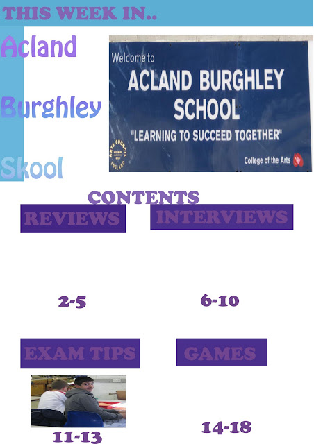
.For the preliminary task we were asked to create a front cover and contents page for a new Acland Burghley School magazine, we had to do this keeping In mind who we were trying to target and how the magazine would represent life at Acland Burghley.

First of all we were given a sheet which outlined all the different aspects of the school that make it what it is today, this included the fact that it has a status of being a 'Arts School', its a mixed comprehensive ranging from the ages of 11-16, its part of the La SWAP Sixth Form Consortium along with three other schools located near by and its heavily involved in a anti-bullying programme as well as other things. From we were asked to look at each of these points and see how it could relate or influence any decisions made on our magazine. For example the fact that it is a Arts school made me see that i should look to including a few pictures of someone maybe dancing or acting and since its a mixed comprehensive i should look to show a even amount of boys and girls in the magazine in relation to what pictures i should use for it.

My next job was to think of a name, subheading and tag line for the magazine as well as a link to the ABS website and the issue number/date of the magazine. After thinking over about this thinking about the different aspects of the school i came up with the name 'Acland Burghley Skool' with the tag line 'The Koolest Magazine Out There!' because I felt it gave it a edgy feeling that would relate to the young audience that I am targeting it at. I then went and took the 6 pictures I wanted for my magazine which had to represent life at Acland Burghley as well as fitting in which the theme of my magazine (pictures can be found in 'Original photos and preliminary task'.

  This is the finished version of my front cover for my school magazine. I decided to use the colours of blue and purple as the main fonts as well as using a font style that i think along with the colour looked very energetic and vibrant which relates with the energetic and vibrant nature of kids these days. I also used a speech bubble with the subheading "meet the students" in it because i thought that if I used a speech bubble coming from a actual student it makes it feel like this really is a magazine by the students for the students which is catering to some of their needs. The image I used for the front cover is very different in contrast to the one shown in 'Original Photos and Prelim Task' this is because i decided to change the colour of the actual image making it slightly darker as well whilst making the background around him lighter to make him stand out more in the image since he is the main point of the front cover. This was done using photoshop because not only did it let me change the colour and light of the image but also allowed to crop and manipulate the image slightly to get unnecessary images in the background which emphasised the fact that the boy is the vocal point of the front cover more.


 My contents page stuck to the same colour scheme of purple and blue like my front cover because I think associated with my magazine. The images on this page have not been cropped of manipulated because I felt that they were not the main points of the contents page so instead I focused on creating a colour backdrop for the feature titles like 'reviews and 'interviews' using photoshop allowed me to create a colour backdrop for this using purple to stick with my ongoing theme of purple and blue. I decided to use a big font size because i felt it would cause less confusion amongst readers.


Wednesday 3 November 2010

Comparasin of Blogs

Music Blog- http://www.guardian.co.uk/music/musicblog

TV & Radio Blog- http://www.guardian.co.uk/culture/tvandradioblog

Sports Blog - http://www.guardian.co.uk/sport/blog

News Blog- http://www.guardian.co.uk/news/blog

Film Blog - http://www.guardian.co.uk/film/filmblog

Science Blog - http://www.guardian.co.uk/science/blog

All these blogs are still the same in the sense that it is people expressing their personal opinion on certain situations but all are themed around different things like sports, music, science etc. They all still have the same level of formality but the language is slightly different to suit the topic they are talking about. For example in the sports blog it says "Johnson hit for six by Sri Lanka" this sort of language is common for a sports blog but would not be for a science one. In my blog I see that their blogs are updated almost daily which is something i should look to adopt with mine.

Music Magazine Online Presentation

This is a preview of the presentation i did where i was asked to do research on a magazine.

Sunday 31 October 2010

Original photos and prelim task

This is the picture I decided to use for my front cover which i think really does represent the calmness and comfortable nature of Acland Burghley, the fact he is listening to music whilst sitting in front of a beautiful back drop shows that school is not only for education but is also a place to relax (when not in lessons).


This is the picture I've chosen to use in the Arts section of my magazine mainly because of the fact that they are laughing and having fun which I think shows the enjoyment that school can at times give to us and since Acland Burghley is a Arts school using this picture fully relates to that aspect of the school.


This is the picture I have chosen to use for the first page of my maagazine (excluding the contents page) that will be dedicated to welcoming new students and also the new headteacher to the school. This picture is very important because it not only shows that it is indeed a 'college of the arts' but also has the schools motto "Learning to succeed together" on it which indicates what the main aim of the school is.


This is a image of the schools football pitch which i include to use on the section dedicated to Acland Burghleys recent school success in football, also I think the lighting of this image expresses happiness and enlightment. 


This is the image i will you use to give a insight into what it is like in Aclnad Burghley when in class. And represents a normal day learning at Acland Burghley school


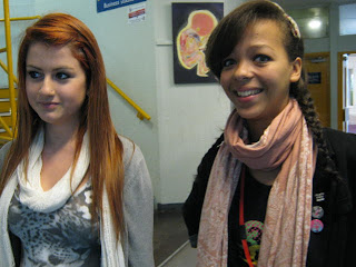
This is the image I will use to introduce new students at Acland Burghley, the fact they are both smiling shows that Acland Burghley is a place you can adapt to and make friends easily so it is a welcoming image for any new students at the school.


This is the front cover of my school magazine for the prelim task.

This is the contents page of my school magazine for the Prelim task.

Saturday 9 October 2010

Content Analysis and Target Audience

In class we have been given two magazines each to analyze each and have compiled some data and evidence on it focusing on its content and the type of audience it is targeting. The two magazines that I have been analyzing are NME and Tops Of The Pops.


The first magazine I looked at was NME. Unlike Top Of The Pops NME is more text heavy and consists of a lot of reading which suggests they are targeting people with a high level of maturity. If we look at the advertisement in the publication we get a good idea of the type of audience they are targeting.  There are 47 advertisements in the entire magazine which cover a good range of products such as video games, music concerts, technology and films. All these adverts put together take up around seven pages of the magazine in total, the main advert featured in the magazine was a four page spread of Halo Reach which is a video game for the xbox on the first four pages of the magazine, although it was the main advert in the magazine it was not he one they were looking to push on to their readers the most, three pages of the magazine were taken up just for listings of music concerts which gives me the idea that the majority of people who read their magazine are likely to enjoy going to music gigs. However there were no TV listings at all which gives me the impression that they are just sticking to music in their genre (Rock) so it wouldn't be a ideal magazine for anyone who isn't a fan of rock.

In terms of what the actual adverts were about, there was 1 advertisement for the IPad, six music related adverts and 1 advert for the video game Halo reach as well as three pages of adverts just for music concerts. However if you take a look at the features in the magazine you would see that they are very similar to every other feature you would find in another magazine so there was no real feeling of individuality there. The editorial of  the magazine covered two pages, whereas the letter page only covered half of a page which suggests that isn't really one of the major aspects of the magazine. There were actually plenty of articles in the magazine of things like interviews for example which covered a whole page. The special features that were present in the specific copy I looked at were a free token for a free copy of the next issue of NME magazine and also polls about the summer festivals Glastonbury and Reading, the features as you can see were not high in number and depth but you can see there intent on getting readers to buy their magazine by getting them involved with polls about Glastonbury and reading which will appeal to people who actually did go to those festivals and also suggests what type of audience there trying to attract seeing as both festivals are mostly targeted at rock lovers, and also the token give away suggests there trying to keep readers interested in their magazine and is almost like a thank you to the reader for choosing to buy their magazine. After analysing NME magazine I have come to the conclusion that their target audience are of a more mature nature who are really into rock between the ages of 16-40, this is because of the formality of the articles and features and also the advertisements in the magazine would appeal to some one of this age group rather than a younger one.


The second publication that we looked at was 'Top of the pops magazine' this compared to NME had far more less featured in terms of advertisements. In total there were only 7 advertisements in the magazine and had topics concerning music soundtracks, new movies releasings and general healthcare. However they did include a lot more features in their magazine compared to NME in which there was very little, features included interviews with Justin Bieber and JLS, free sticker giveaways and also special prizes to win movie tickets. Like NME there were no T.V. Listings featured but also no small advertisements which did actually suprise me. Moreover there was actually no editorial page, 6 full article pages and only one letter page which possibly gives a hint to the age range of the audience that their trying to attract.


From the information I have gathered it is clearly evident that Top of the Pops magazine are generally trying to target their magazine at young females between the ages of 8-15. They are doing this through trying to cover most of the aspects that appeals to the young female culture of society today. The special features, for example the giveaway of free stickers, indicate that they are trying to target a audience of a young age whilst the interviews with popular contempary artists like Justin Bieber and JLS who are very much 'the flavour of the month' with girls shows they are trying to appeal to females rather than men. In contrast, NME are instead swaying towards a more male audience although the masculinity aspect of it may attract young women and mature women as well as the fact that 'Rock' as a genre is generally listened to by both men and women. The demographic scale of these two magazines are pretty much spread across the whole of the UK, with there being no specific area both magazines are targeting, although there are areas of the country, Camden Town in London for example, where Rock music is generally found to have a bigger culture and more popularity there.


Sunday 26 September 2010

Uses and Gratification Theory

The 'Uses and Gratification' theory proposes the idea that the audience has a set of needs, which the media meet in one form or another.

The first being division, which means a form of escape or release from everyday pressures, whether its a long day at work or school, this part of the uses and gratification theory suggests that we all need a moment to escape from the strain that everyday life can bring us. This could be through things like social networking sites like Twitter or Facebook, trips to the cinema to watch the latest films out, watching your favourite television programmes, listening to your favourite radio stations, going on video sharing sites like Youtube and Daily Motion, reading your favourite newspaper/ magazine and playing video games.

The second is through surveillance, this means information which tells you 'what's currently going on' in the world. There are many ways in which this is done, one being through E-Mails which is a fast and efficient way of sending news around and in the current fast paced world is probably the most common way of sending news around, another way is again through social networking sites like Facebook and Twitter which are set up in a way which allows this to be done hence why they are called social-networking sites. One other way is through magazines and newspapers which are especially good in telling you about 'what's going on' based on your preference of the newspaper/ magazine. For example if you're interested in finding out about what certain celebrities are getting up to gossip magazines like now! and heat magazine might be better suited than you rather than a broadsheet newspaper like The Guardian or The Daily Telegraph. Also television can be used as well. BBC, ITV, Channel 4 and five have constant news updates running through out the day, as well as television programmes like BBC Breakfast, Daybreak and T4.


The third is through 'personal' meaning you yourself, this allows you to compare your own life with the characters or situations that you are seeing on screen. Not only does this let us have more of a connection with what's on,it also puts the situations on screen into are own personal life so its almost as if what ever was going on, on the screen is a real life situation that we are apart of.


The fourth and final form is by personal identification. This is in which the media help you portray and convey you're own ideas and views of the world. This is a less obvious form as people often enough do not even realise the ways in which the media influence us. For example if we see a poster of obese person eating at McDonald's are first thought will be that McDonald's is bad for you and therefore might make us portray are own view that McDonald's is not good for you and you shouldn't eat it.


In my opinion the one that is needed most is Personal Identification because it actually effects that way that we ourselves think and how we see the world rather than what someone else thinks. The second one I deem most important is Division mainly because I think it is very important that we as human beings get time to ourselves to enjoy ourselves and delve into a completely different world for a bit which relieves us from the stress and pressures that we face in our own. The need I think is the third most important is Surveillance, this is because I think in such a big world it is important to know and understand what is going around you. Finally the need i deem least important is Personal,, although I still think it is important I don't think it is as essential as all the others.

Introduction

Hi all and welcome to my music press, my name is Jassiem (that's pronounced Ja-zeem) and I am happy with you all for visiting my progress in media and my personal views and opinion on music. The type of music I will be primarily focusing on is Hip-Hop/R&B, I am a big fan of both genres and have great respect for what they both represent. I am a big fan of Hip-Hop/R&B magazines such as 'XXL' and 'Rap-Up Magazine' and although i don't subscribe to them I go on their websites frequently.

The main objective in media this year is to design a brand new magazine, which targets the following audience:

A teen audience between 12 and 15 years old or
An older teens audience between the ages of 16-19.
Aimed at a UK magazine audience

The magazine is to be sold on a weekly, bi-weekly or monthly basis.

You will have to decide on:


  • A title
  • The genre(s) of your magazine
  • Its style and form
  • Magazine conventions-and comparisons to existing music magazine publications
  • Create a brand identity/use of logo
  • Its use of representation
  • The language of the magazine article 
  • Use of original and not found images
  • Is it a regional or national publication
  • Consider who is your target audience 
It is important that you have created an image for a new band/ artist. This artist/ band is whom you are promoting in your music magazine. The original images you are to take have to promote the image of your artist and the magazine article is promoting and publishing a new album/ single and the launch of the career of the musicians.


This video gives a idea of the type of music I'll be focusing on and also the imagery of the video fascinates me as well.